I’m a data and graphics journalist at The Wall Street Journal where I crunch numbers, write code, make graphics, and report stories.
naterattner[at]gmail.com
@naterattner
Selected bylines
- Russia-Ukraine War Adds Pressure to Already High Food Prices, Threatening Food Security for Millions (WSJ)
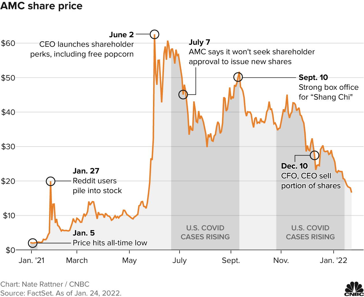
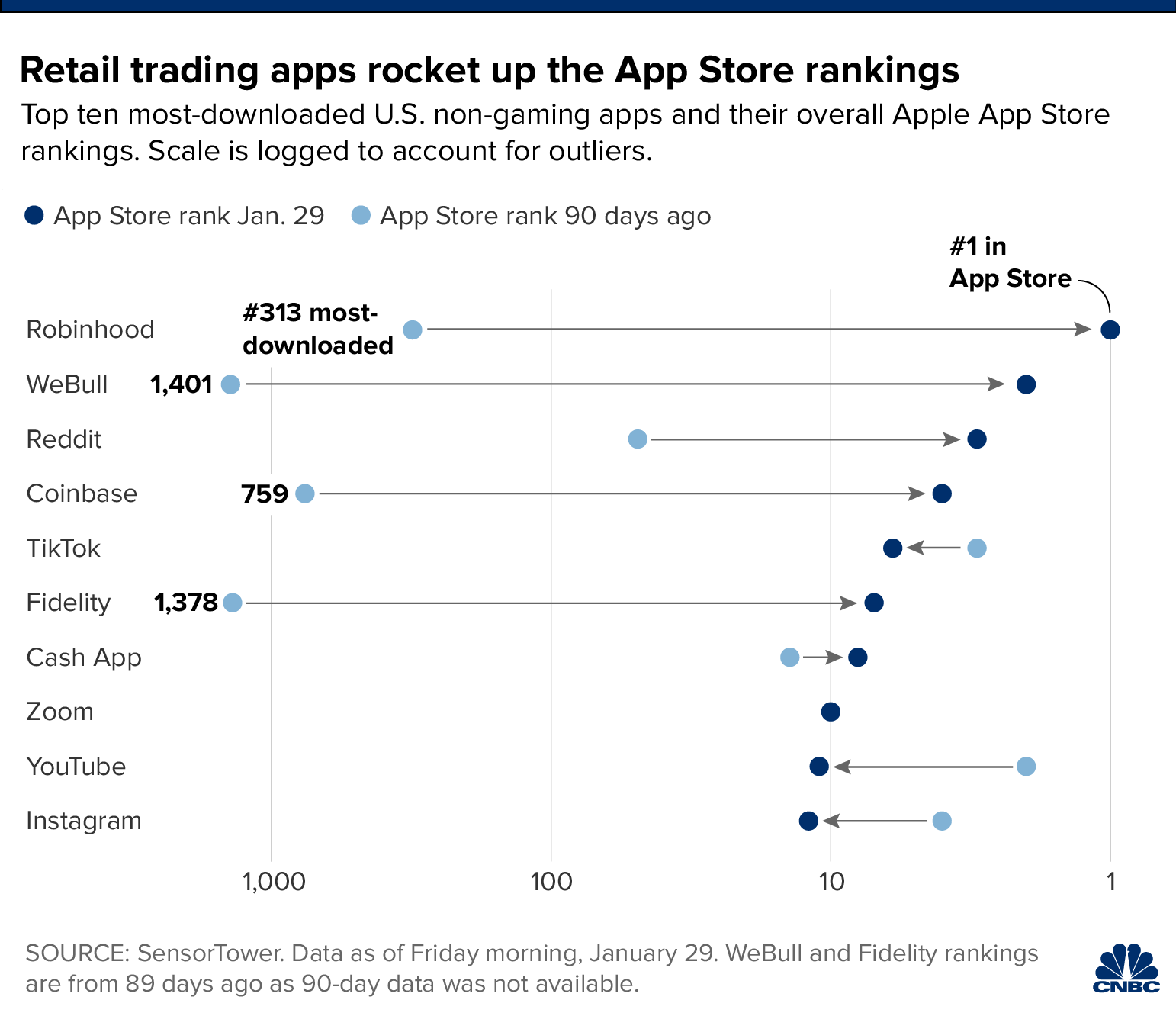
- Meme stocks, SPAC craze and a $100 million deli: 2021 marks a wild year in the stock market (CNBC)
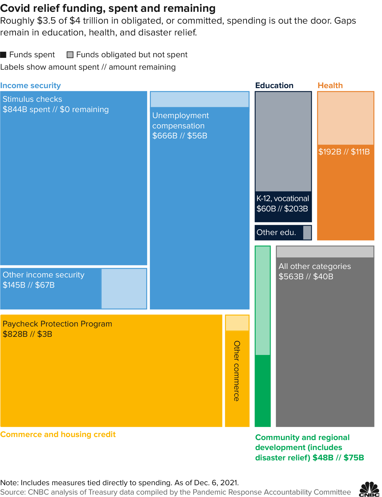
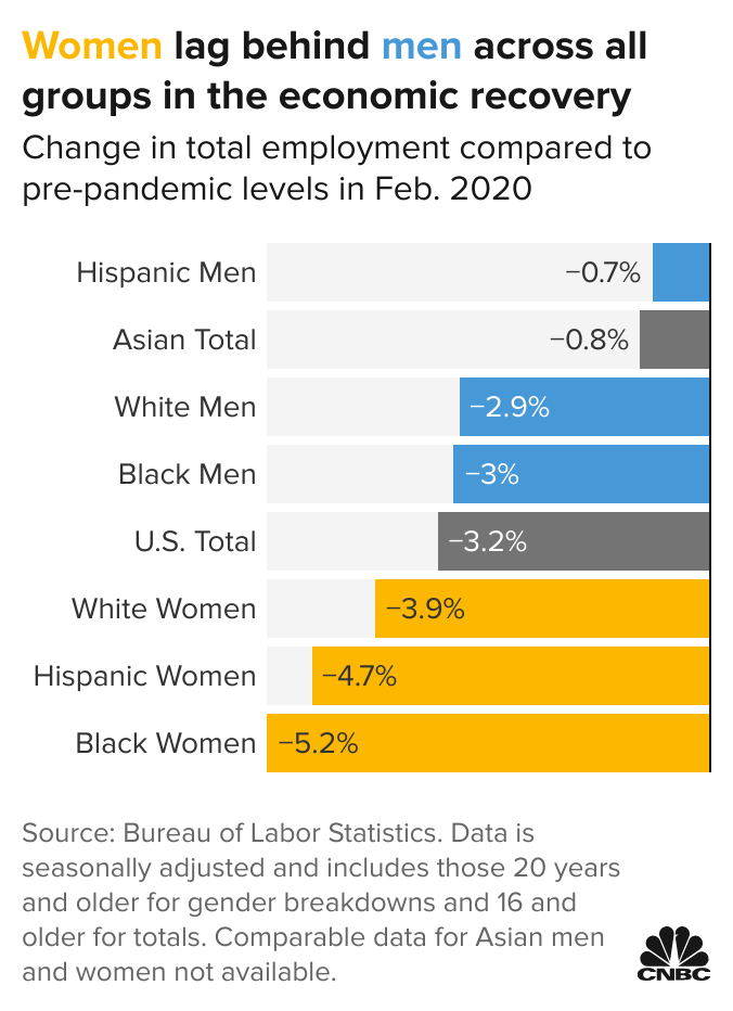
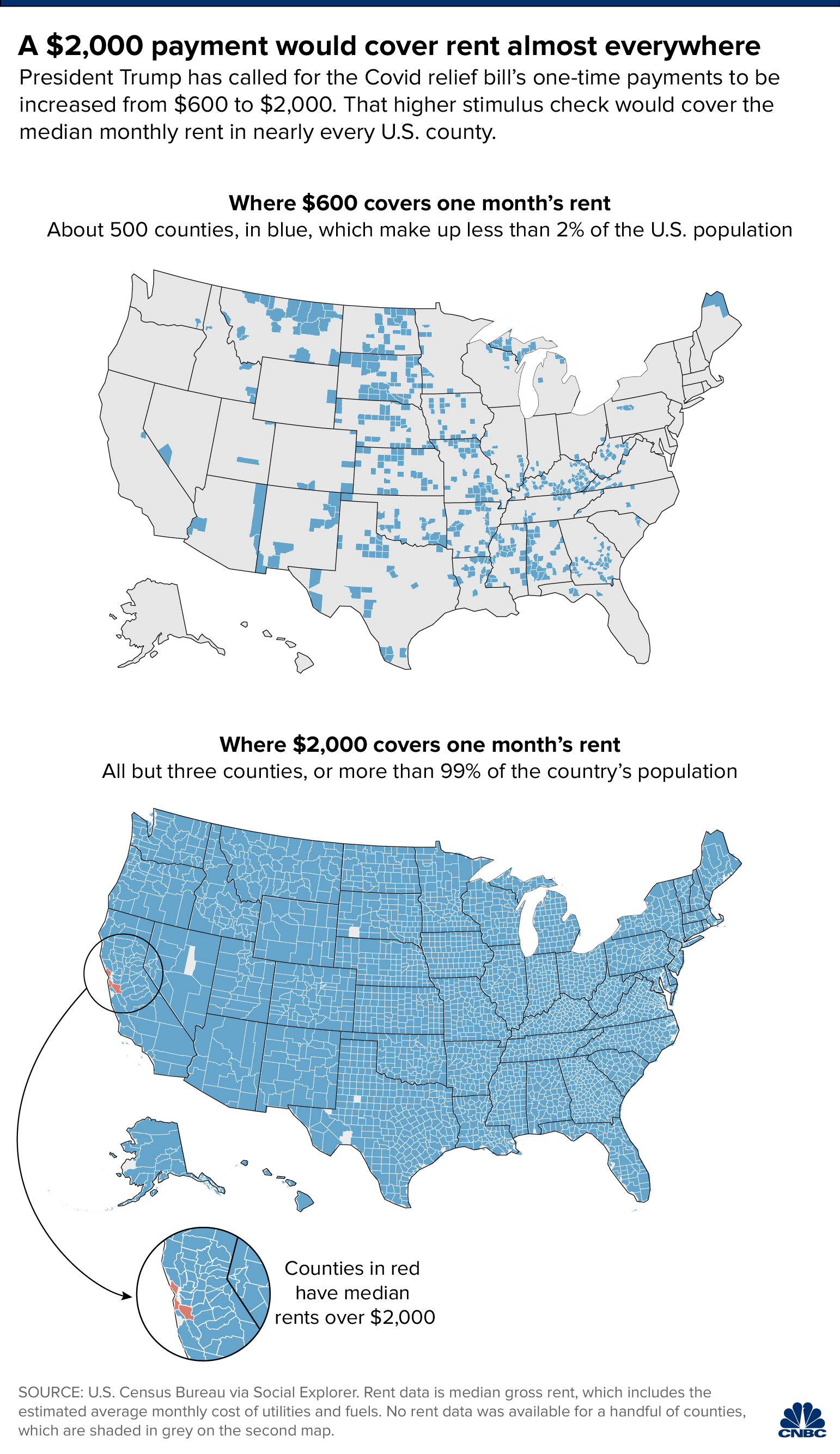
- The U.S. has spent most of its Covid relief funding, but there are still billions left to dole out (CNBC)
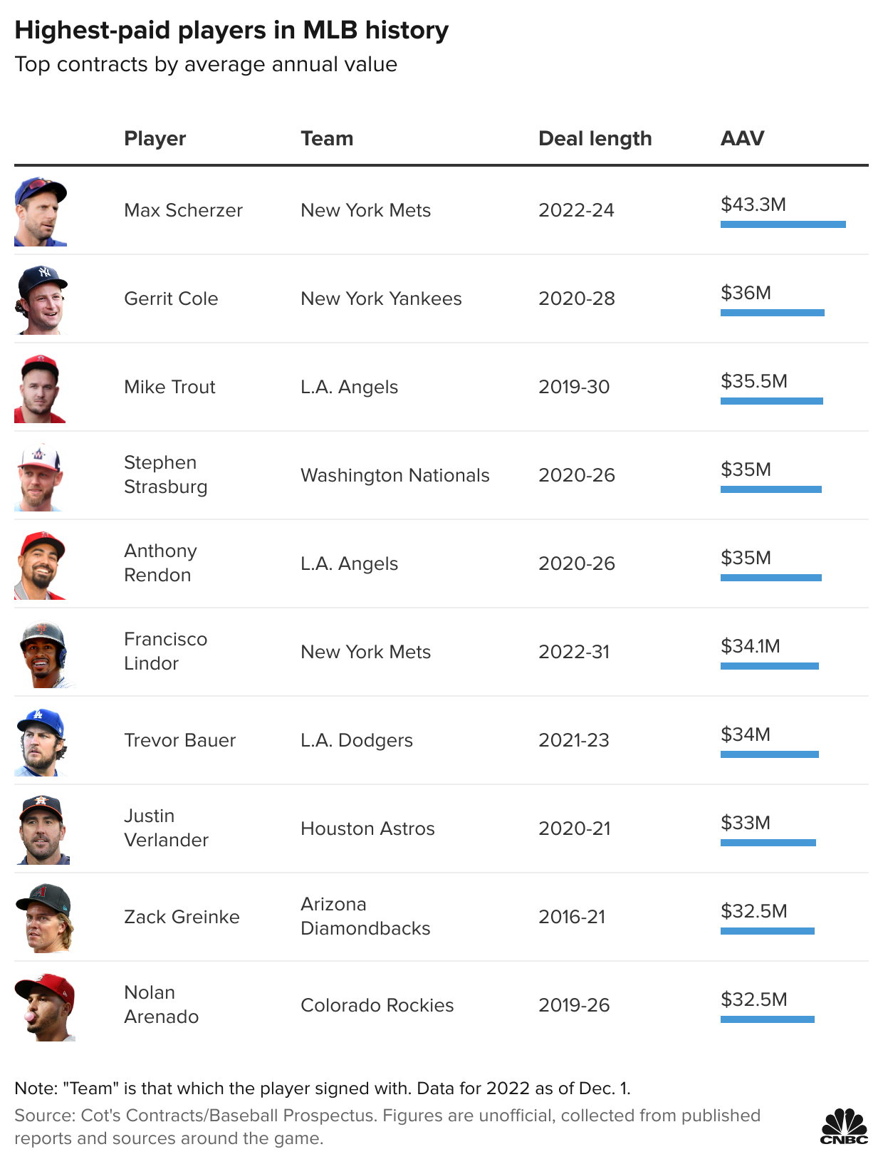
- Baseball’s record-setting free agency spending spree, in charts (CNBC)
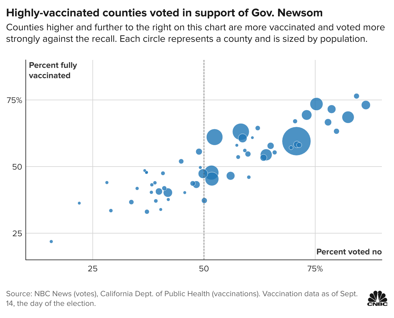
- California counties with high Covid vaccination rates helped Newsom cruise to victory in the recall election (CNBC)
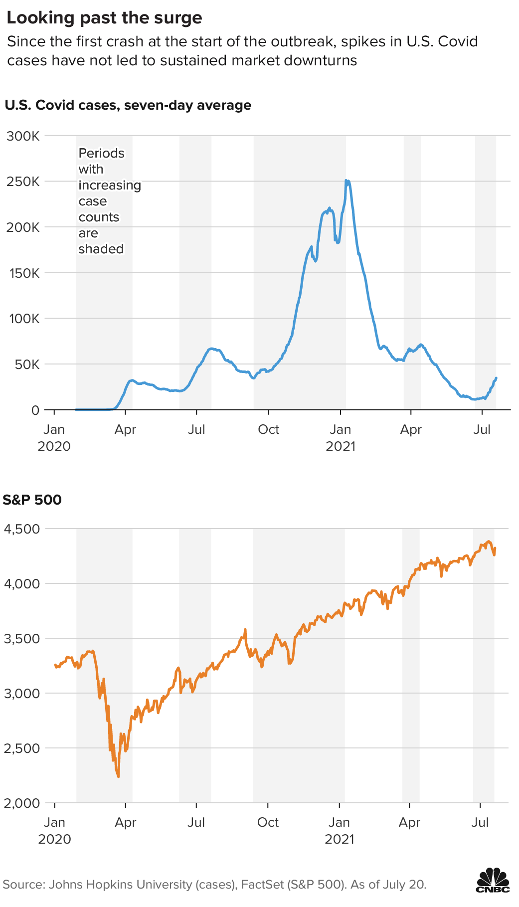
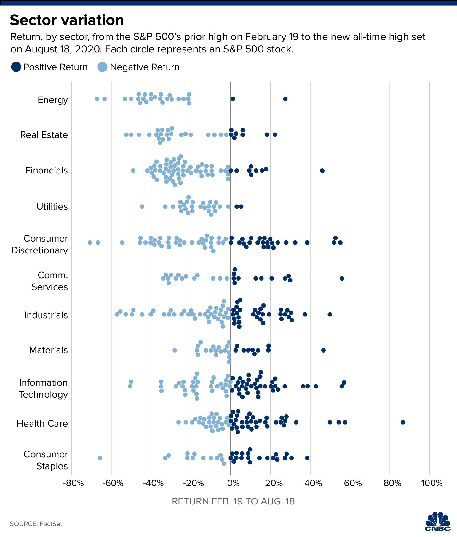
- S&P 500 doubles from its pandemic bottom, marking the fastest bull market rally since WWII (CNBC)
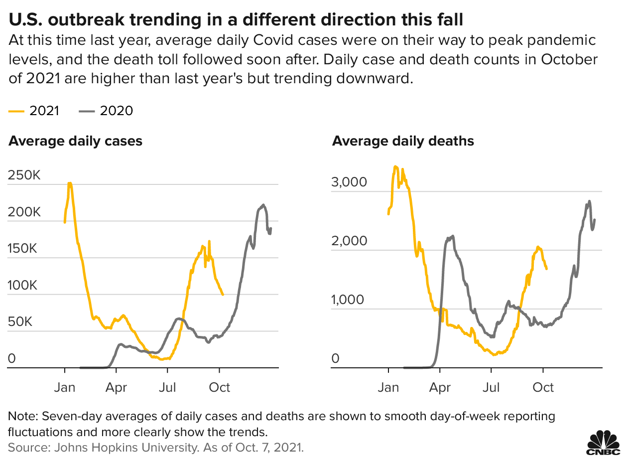
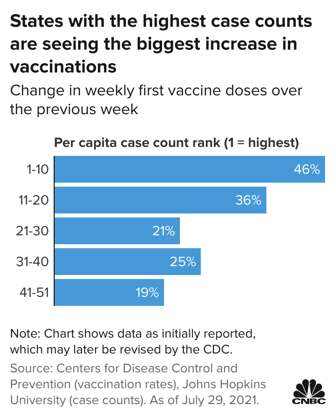
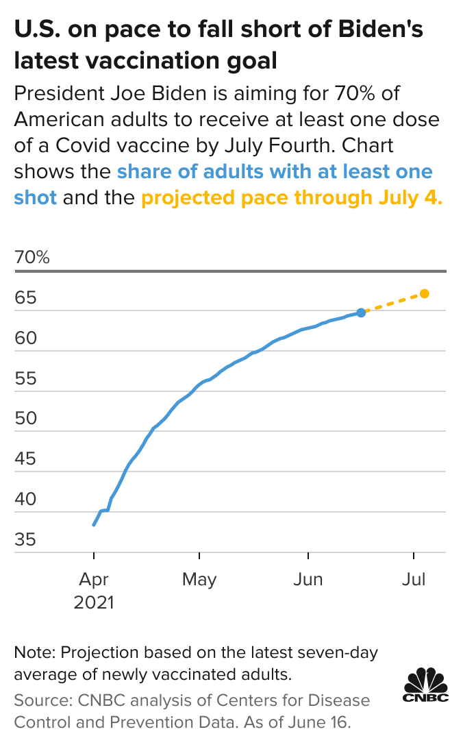
- U.S. Covid vaccination rates rise as Americans in hard-hit states rush to get shots amid delta fears (CNBC)
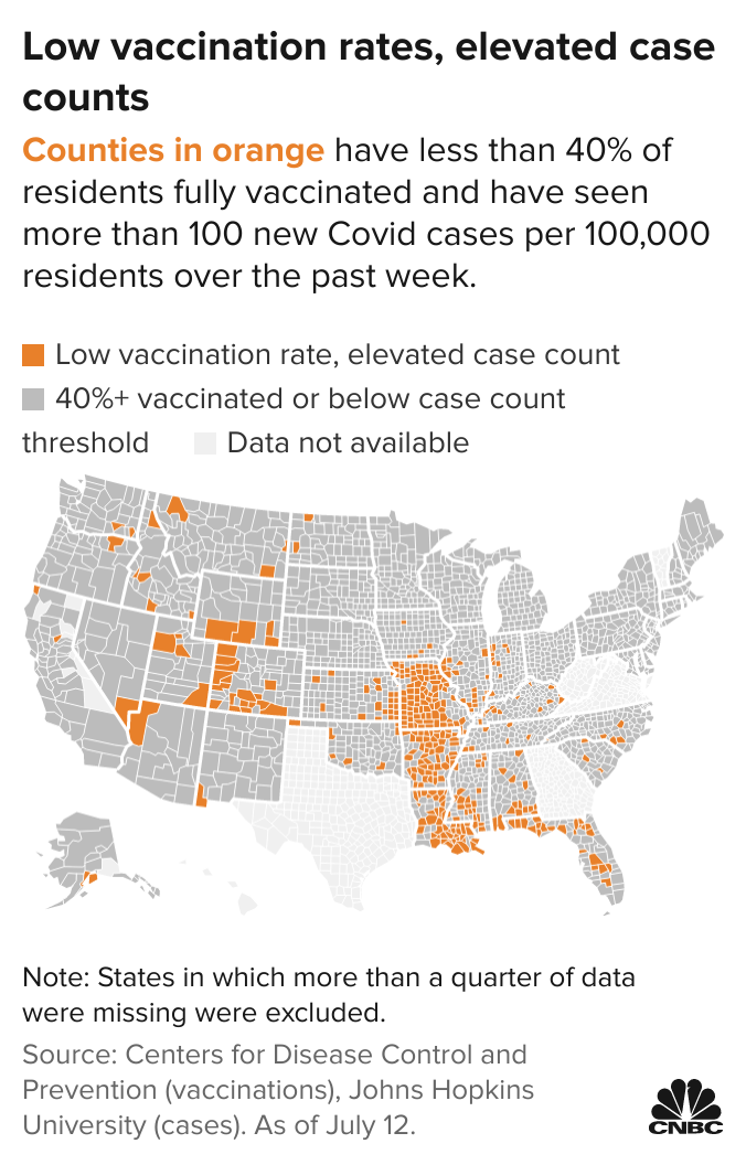
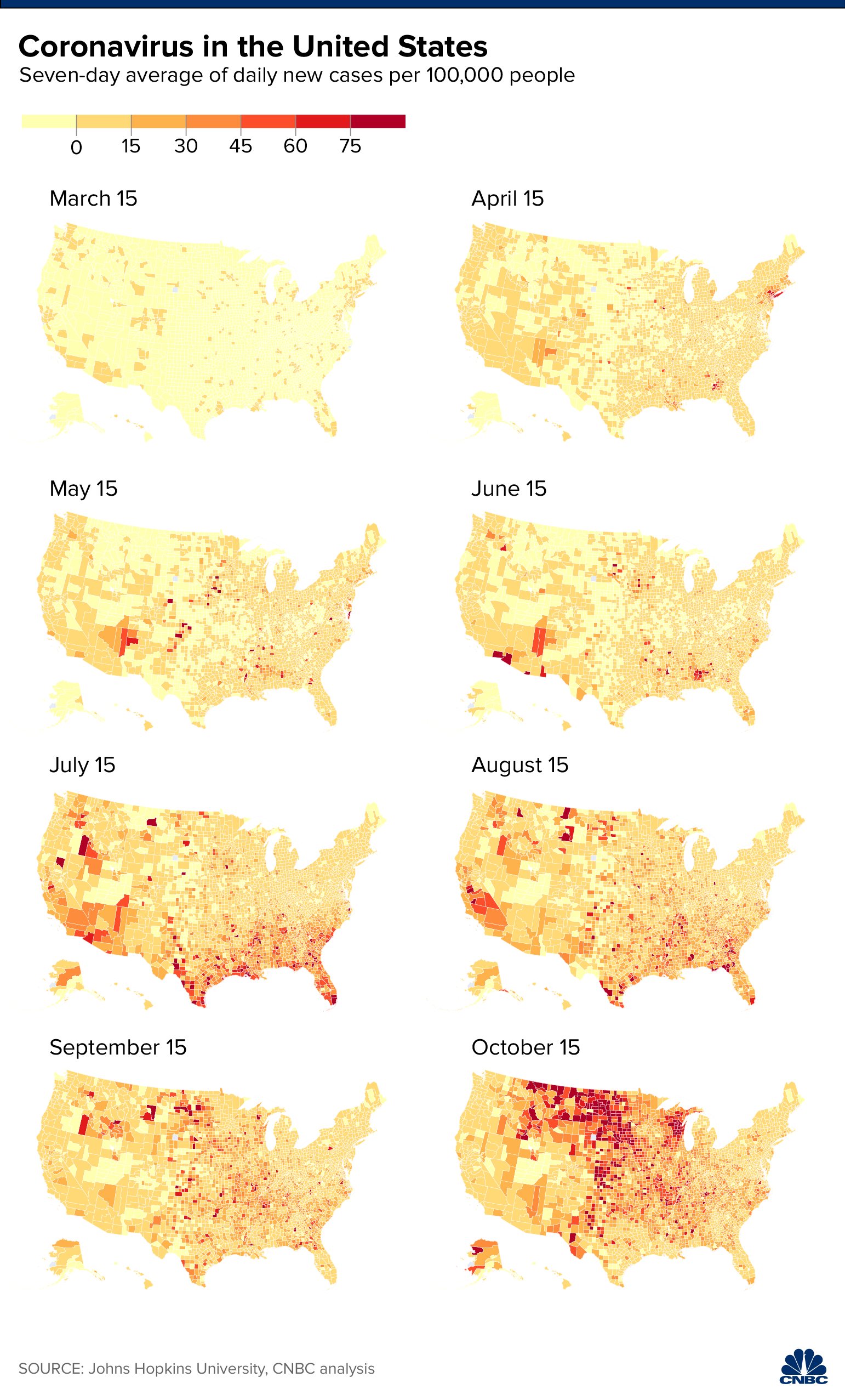
- Should you be wearing a mask again? Here’s a map of the Covid hot spots subject to the CDC’s new guidance (CNBC)
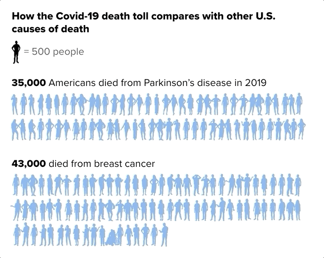
- U.S. surpasses 500,000 Covid deaths after yearlong battle with pandemic (CNBC)
- Trump’s election lies were among his most popular tweets (CNBC)
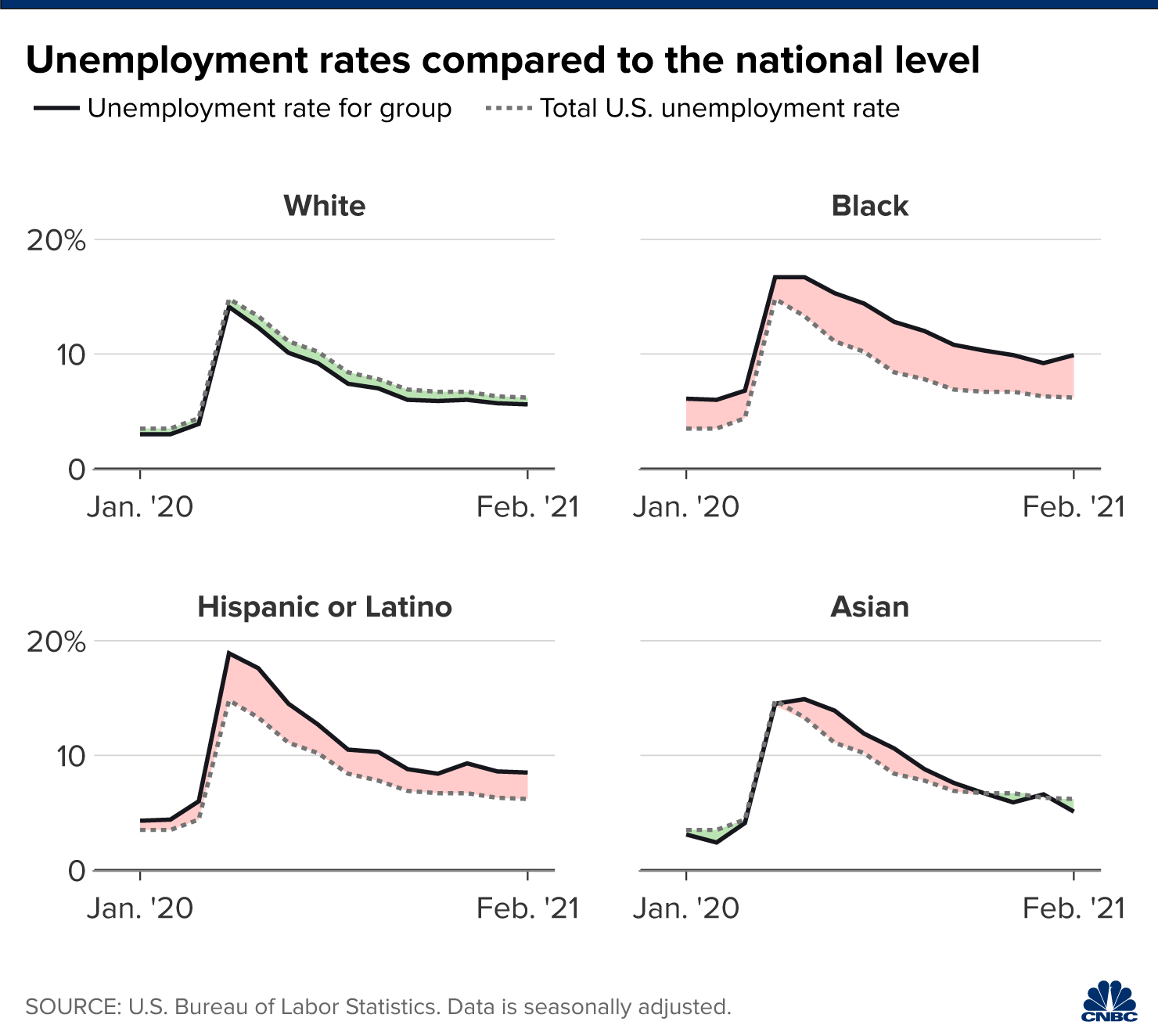
Graphics